Relationship between infections and deaths from Sars-Cov-2
Investigating the relationship between infections and deaths at a global level is a useful exercise to understand how the epidemic has evolved over the months, as well as its possible prospects
Published by Donatella Talucci. .
Covid-19 Great Lockdown Conjuncture Uncertainty Global economic trendsThe health emergency linked to the spread of the Coronavirus on an international scale has had a significantly negative effect on world trade. The latest available data, although still providing a negative picture, show a substantial recovery in trade, giving hope for a less negative end of the year than assumed in the initial months of the epidemic. This perspective depends closely on the evolution of the pandemic on the international scene: a possible worsening of the pandemic could deeply deteriorate the scenario in the coming months, compromising the ongoing recovery. To this end, it is particularly interesting to analyze the evolution of the epidemic during these months and, in particular, to investigate the relationship that exists between infections and deaths in the world, in order to better understand the further consequences that we could expect.
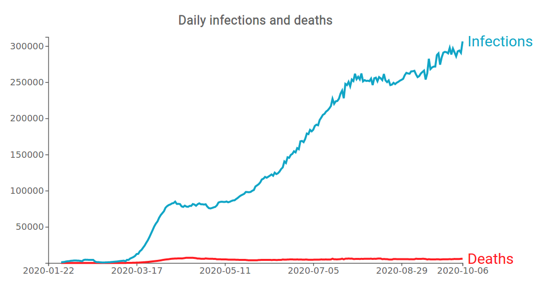
In February 2020, the virus began to spread first in Europe and then in the rest of the world, so that the World Health Organization declared a Covid-19 pandemic on 11 March. The graph above shows the curve of new infections and new deaths (7-day moving average) of Sars-Cov-2 from the beginning of the spread of the disease until the last days of September. Looking at the chart it is clear that, in the face of an ever-increasing trend in confirmed new cases, the curve of new deaths has been relatively stable since the beginning of the summer.
Focusing on the curve of new confirmed cases, we can clearly detect three phases of the epidemic, as shown in the graph below.
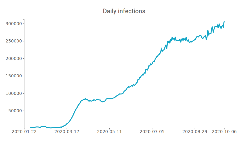
The first phase represents the period from the beginning of February to about May, whose main protagonists were China and Western Europe - in particular Italy, Spain and France. In the phase from January to mid-February the curve looks quite linear with respect to its future trend, for a series of reasons. First of all, the little (apparent) spread of the disease, known for that period only in China and consequently the poor screening capacity, that did not allow the real and effective awareness of the number of infected people.
On 21 February in Italy the first case of Coronavirus was diagnosed, giving rise to what will be called "phase one", followed by Spain, France and the United Kingdom, albeit with some minor time differences. In this initial phase of lack of knowledge of the disease, the contagion between individuals took place quite quickly; although the apparent number of infected individuals was initially low, with a more conscious knowledge of the virus and the symptoms that it caused, the number of daily infected individuals started to show a significant growth. As can be seen from the graph above, in this initial and critical phase the curve undergoes an exponential increase, precisely for the reasons listed above.
During this period, growing awareness led many countries to take more or less restrictive measures, in order to prevent the spread of the virus. Many governments opted for an almost total closure, known as lockdown, which led on average to a sterilization in the number of new infections, as is evident in the months of April-May. This allowed governments to progressively relax restrictive measures. For example, Italy ended quarantine in June, followed by Spain and France.
Thus begins the "phase two", characterized by a greater knowledge and awareness of the disease; new measures are put in place, such as spacing and constant use of the protective mask.
In the meantime, however, in other countries such as Brazil, the United States, India, Russia and Turkey, contagions do not subside but keep on increasing on a daily basis, as highlighted by the worldwide number of confirmed daily cases. In spite of a drop in the number of contagions in many other countries, the curve continues to rise until July, when we can notice a "stabilization".
Unlikely, the "stabilization" of the curve is only temporary, as from the second half of August the curve undergoes a further upward turn. We are in the so-called "phase three", characterized by a new rise in infections, also on the European scene.
It may be useful to analyze the three phases of the pandemic, not only in terms of infections but also in terms of deaths.
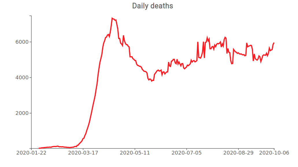
In contrast to the ever increasing dynamics of the curve of new confirmed daily cases, the curve of new deaths is characterized by an initial phase of exponential increase, followed by a stabilization phase.
The initial exponential increase in contagions has led to a stress on the health care systems of many countries, faced with a new disease without having the necessary tools and treatment to combat them. The effect has been a sharp increase in the number of deaths. In less than two months, the number of deaths from Covid-19 in the world goes from a few hundred in early March to over 7000 at the end of April. Between the end of April and the first half of May, the accumulation of health knowledge has led to a progressive improvement in the management of the sick, bringing deaths to fall below the threshold of 5000 cases per day since June.
Subsequently, the curve remains almost constant over time, although showing a certain variability. It should not be forgotten that the curve represents an aggregate estimate of data from different countries, and consequently the volatility is an expression of a counterbalance between the different circumstances.
It is possible to conduct a joint analysis of the dynamics of daily infections and deaths through the apparent lethality rate (CFR, case fatality rate)[1].
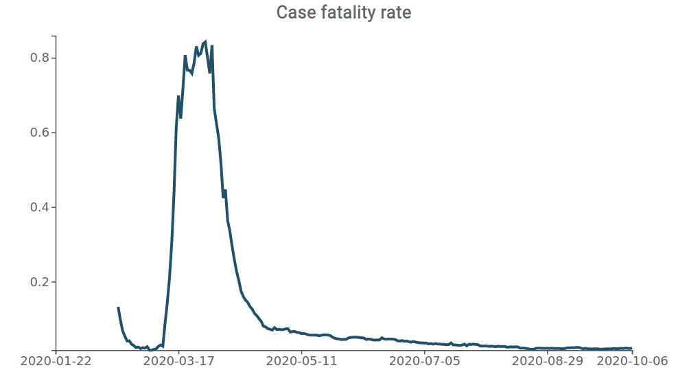
The graph on the case fatality rate shows that, after the initial critical phase, there has been a progressive reduction of Covid-19 lethality in the world.
At the current state of knowledge, it is possible to exclude a return to a worldwide situation in terms of deaths from Covid-19 even close to that experienced in the second quarter of 2020, for the following reasons:
- Increased knowledge of the virus and greater capacity of the health care system to manage the disease
- Greater screening capacity and consequent increased likelihood to detect infections in time
- Reduction in the average age of infected people
- Greater attention to virtuous behavior and social distancing practices
As far as the number of confirmed infections is concerned, it should also be borne in mind that these reflect both the spread of the virus and the increased detection capacity, thanks to the increase in swabs carried out on a daily basis. This variable significantly influences the increase in infections; on the contrary, the daily number of deaths appears as a more robust variable.
[1] The Case Fatality Rate (CFR) indicates, through a given percentage, the amount of people who die from an illness compared to the total number of patients. The data is therefore different from the mortality rate, which instead indicates how many people have died from an illness on the total population, including both sick and healthy people. It is calculated as the ratio between the number of deaths at time t and the number of confirmed at time t-n (in the case under analysis it was chosen n=20).
You may be interested in:

IMF WEO Update July 2026: a (precarious) balance between war and technology
Published by Alba Di Rosa. .
Macroeconomic analysis Asia Emerging markets United States of America Uncertainty IMF Eurozone Global economic trendsPer il 2026 il Fondo ha rivisto lievemente al ribasso le stime di crescita del PIL mondiale, ora previsto al +3% [ Read all ]

US Trade Deficit Put to the Test by Tariffs: Evidence from First-Half 2026 Data
Published by Marzia Moccia. .
Slowdown Conjuncture United States of America Uncertainty Trade war Foreign market analysisAmid uncertainty that has now become the new normal, international geopolitical tensions, and the reshaping of the rules governing global trade, the United States undoubtedly remains a key focus of }... [ Read all ]

Plastics processing machinery: what are the main markets and how is the competitive landscape evolving?
Published by Mauro Badanelli. .
Industrial equipment Conjuncture Industries International marketingPlastic processing machinery represents one of the most important technological pillars of modern manufacturing supply chains. Through processes such as injection moulding, extrusion, blow moulding }... [ Read all ]